
‘And I Told Them I Invented Helvetica’ is a graduate thesis that explores Los Angeles’ penchant for supergraphics and their capacity wayfinding and placemaking
Place making in Los Angeles is a curious thing. Depending on one’s scale of reference, or perhaps speed of travel, one may reference one’s location based on the freeway exit they’re passing or the interchange through which they have just merged. Conversely, one may forego these pseudo Cartesian coordinates and describe their location based on what building they are next to or who’s Walk of Fame Star by which they are drinking coffee. Los Angeles’ penchant for super-graphic locales is referenced by Claes Oldenburg’s City as Alphabet. He imagines a city where the map of Los Angeles resembles recognizable Roman letters in plan; where buildings are made of one to many letters, or perhaps words. A parallel can be drawn between a building spelling out its function in English, and Robert Venturi’s analysis of ducks and decorated sheds in Learning From Las Vegas. However, what architectural arguments can be explored if a building’s program and envelope are not explicit through visual cues?
In cataloging architectural examples of buildings that look like things, there is an opportunity to explore those without anthropomorphic features. By defining another category of buildings/things that look like buildings/things, objects that resemble archetypal architectural form that are not specifically made for habitation is an area studied by Andrew Kovacs in Architectural Affinities. Kovacs catalogues fetish-scale objects of architectural landmarks and presents them in a way that questions the scale of the original object. By scaling these miniatures to a habitable size, part to whole relationships shift drastically. The tectonics of a giant building with no parts is a major consideration for this studio.
The creation of these giant buildings will reference German and Anglo-Saxon letterforms, and through a process of architecturalization by which these letters are represented through well-understood architectural diagrams such as the 9-square grid, to create volume and architectural massing. The formal qualities and super graphic-like massing of these buildings will fulfill this studio’s hypothesis of architecture having the capacity for place-making. By contradicting the Modernist argument of explicit form and placelessness, and the Post-Modern idea of context-sensitive interventions, this studio will experiment with several Los Angeles locales by harnessing a particular object’s ability to define the identity and culture of those who live nearby.


“Sitting in a car and watching letters silhouetted against the sky has always seemed to me the basic Los Angeles experience. Some of these letters are colossal- the “M” and the “T” on Pico Boulevard. Another source of the association of letters and landscape is the map of the area one has to consult. I imagine the coordinates, for example, constructed to cover the territory it fills on the map; or, a colossal alphabet spilled haphazardly over the basin - an effect like an earthquake. The characters become landmarks of community: one may say, “I live down by the ‘L’ you know, you can spot it from the freeway.” It may ease the sense of loss at the removal of the verbal element from telephone changes.
A city is all words - a newspaper, and alphabet. It would allay the strain on the imaginations of architects and their clients if a law were passed requiring all new buildings to have the shape of a letter or several letters, or a word. Seen from below, like the unfinished freeway connection ending abruptly against the sky, the result would be modern and traditional, elementary, graceful and informative.”
-Claes Oldenburg: City As Alphabet

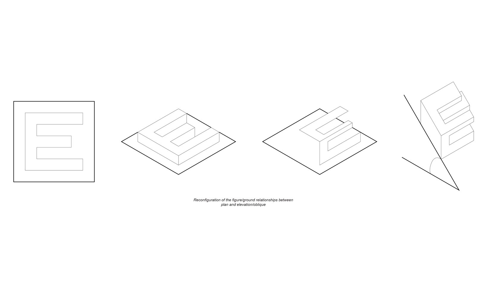
This thesis references typeface letterforms, two-dimensional graphics that were not intended to create space, and re-presents them in an architectural format. The 9 square grid is a widely used and well-documented architectural diagram that can be found in many buildings today. Through a regimented geometric process, any of these two-dimensional graphics can be described in three dimensions, and therefore have the capacity to house building program.
Those who are native to Los Angeles know the feeling of locating oneself within the city based on certain freeway exits or particular local landmarks. This thesis aims to explore whether a building can be design specifically for placemaking and generate its own myths and culture, rather than an identity being placed onto the structure after construction.
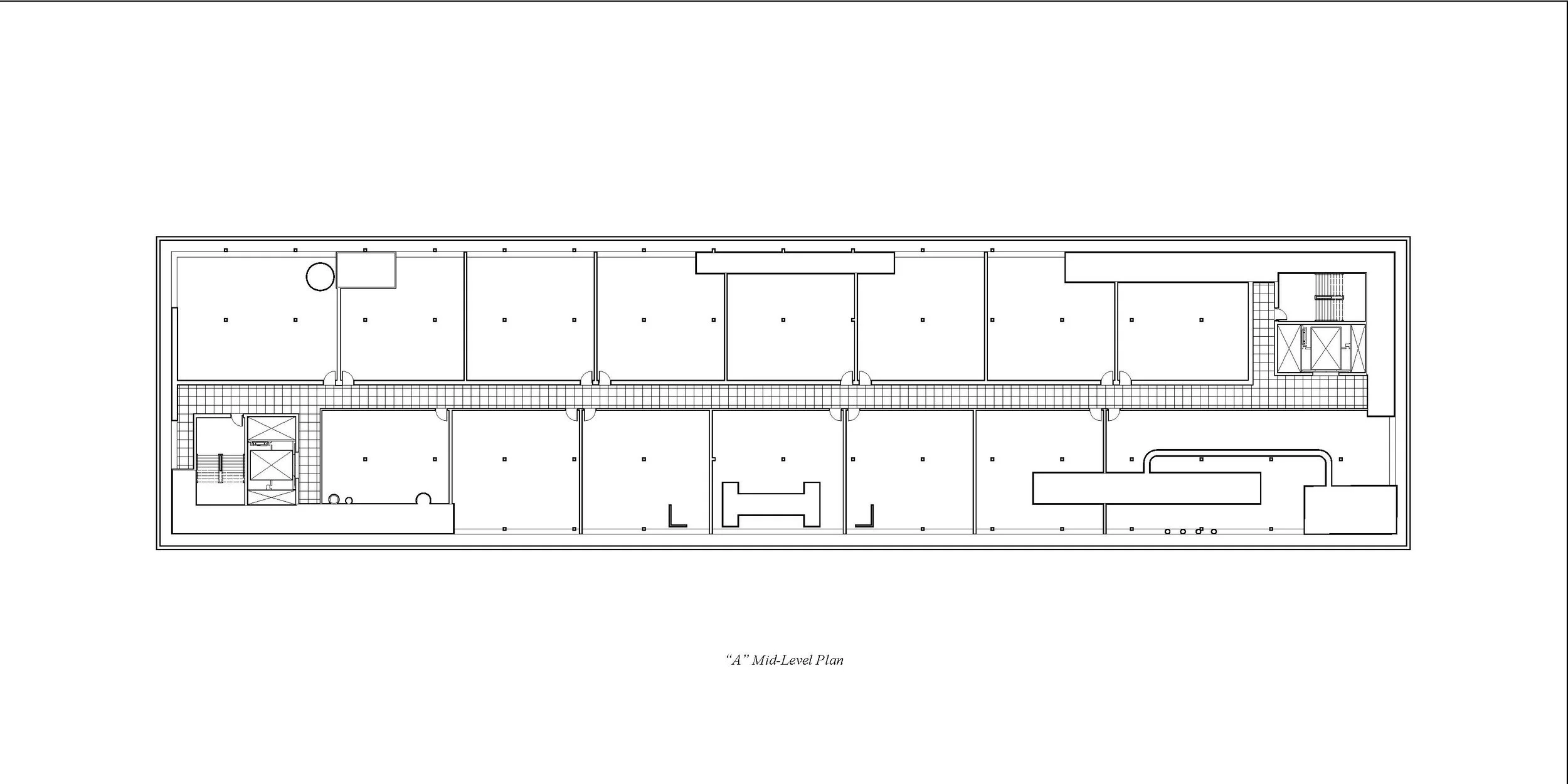
There are four qualities that buildings generated from this thesis must have in order to fulfill the hypothesis that buildings do have the capacity for placemaking in Los Angeles. The first is whether it has gained enough volume in the geometric process to actually house an architectural program. The second is the physical size of the building and whether it is big enough to be considered a monolithic supergraphic. The third is the buildings location. In the volumetric process, the figure/ground relationship shifts from plan view to elevation view, and this allows for slopes and hillsides to be considered for a potential building site. The final quality these buildings must possess is whether it can be seen from afar. Each building site will have a prescribed visibility radius for locals to reference as a physical sphere of influence.


Midterm Presentation


Thesis Presentation
Hello! My name is Kevin Finch, I’m a Los Angeles native, and I find wayfinding in this city to be curious thing. Say, you’re driving on the 101 and someone calls you wondering where you are. You might say, “oh, I just passed Normandie,” or “I’m exiting Western.” Or if you’re meeting a friend from out of town and again, they give you a call: “Hey, I’m on Hollywood boulevard, but I can’t find you.” You might say, “I’m right between Fred Astaire and Janis Joplin.” Or if you’re hiking through Griffith park, you might want to stay on the left side of the Hollywood sign to snap that selfie. Because of the supergraphic nature of this city, this thesis explores typograpy’s capacity for wayfinding at an architectural scale.
In Steven Holl’s alphabetical city, he has documented a series of buildings that look like letters from plan (displayed in oblique). The collection of these displayed as such gives them a font-like quality. I have created my own font by reconstructing the English alphabet using the 9, 16, and 25 square grids. Claes Oldenburg imagines a Los Angeles where people locate themselves by judging their proximity to letter-shaped buildings that can be read as such. In order to maximize individual legibility, this thesis preferences buildings that look like letters in elevation.
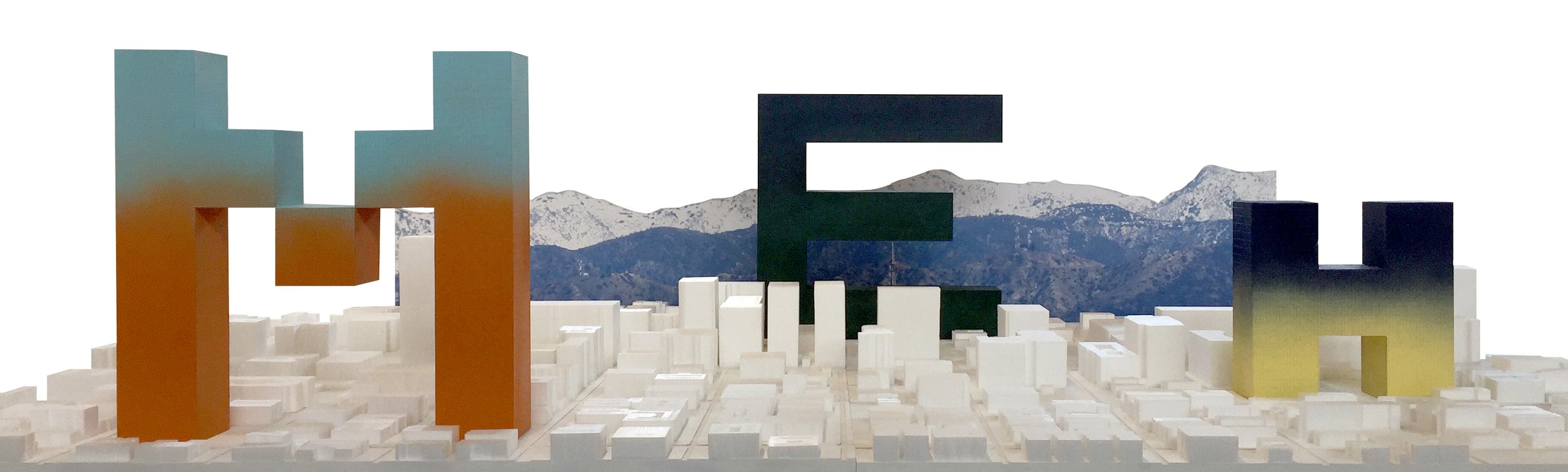
In designing a font, the space between the letters is just as important as the space of the letters themselves. The absolute scalability of this font allows for a number of scales and programs to be accommodated (specifically here, social housing) while the number of individual letters in a given project may form recognizable words. Depending on context, each project’s visible radius (and therefore placemaking efficacy) becomes a factor.
Since we are dealing with very large, urban supergraphics in Los Angeles, we have to talk about Ed Ruscha. Take for example “Pay Nothing Until April” This phrase, written in its own font (Boy scout utility modern) against a snowy mountain range with a gradated sky. The layers of the painting set up a series of backdrops composed of grandiose scenes and subliminal advertising text. Consequentially, this thesis operates within a series of scales (specifically excluding some) and backgrounds.
Some designers may throw around the phrase “making a building work” and colloquially we understand this to reference structural systems. But what might a building look like when building infrastructure is included? While the modularity and scalability of these letters addresses pragmatic building requirements, the interior organization is free to exist in a proliferation of functional and decorative systems. Because this thesis focuses on the micro-detail scale, and the macro urban scale, the visual disconnect between the interior and exterior systems is a deliberate non-sequitir.
In the process of architecturalizing letterforms, I have set up a series of constraints and opportunities to explore typography’s capacity for placemaking and wayfinding in the city of Los Angeles. Thank you.